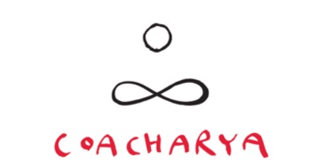
Here’s a bit of the back story in Prashant’s own words of how our logo came to be. It’s a creation of Prashant Miranda. To see more of his work, check out: http://prashart.blogspot.com
An image came to me during our conversations to understand a bit more about the concept of Coacharya. Some of the words that came up while talking to you two were: Transformative. Zen, Now, Eternity, Future, CEO, East and West, Coaching.
There was a definite Zen angle to the whole thing and 2 symbols came to mind.
The circle and infinity.

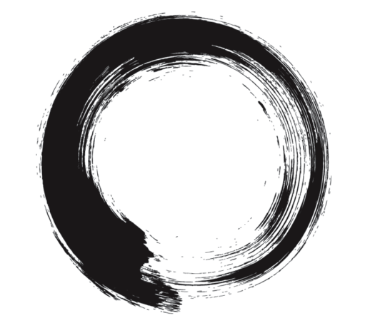
The Japanese Ensō circle defines enlightenment, elegance and strength. It is an “expression of the moment”.
The ensō is a circular symbol often referred to as “The Zen Circle“. The word itself simply translates to “circle” in Japanese; however, it embodies one of the defining aspects of Zen Buddhism, no-mind. A state of no-mind is where a person is free from thoughts and emotions while being completely present in the now.


The infinity symbol represents eternity.
The Isha Upanishad of the Yajurveda (c. 1200 and 500 BCE) states: If you remove a part from infinity or add a part to infinity, still what remains is infinity.
So I decided to put the 2 elements together…
…and this is what happened.
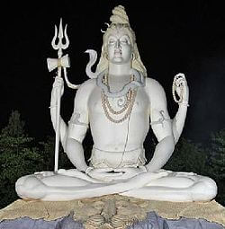
A rather symbolic figure of a person sitting cross-legged.
The final outcome:

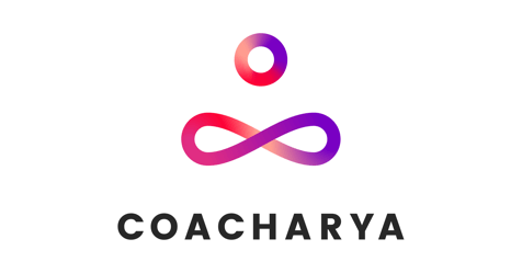
In 2017, Sash Singh further developed the Coacharya visual brand and updated the logo in the process. You can see Sash’s work here: http://www.sashsingh.com/


